ไอเดียออกแบบบรรจุภัณฑ์
1. ไอเดียออกแบบบรรจุภัณฑ์
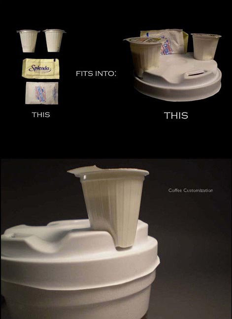
2. ไอเดียออกแบบบรรจุภัณฑ์
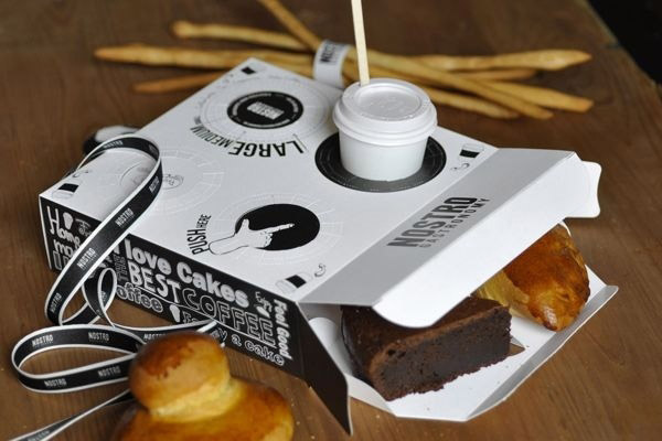
3. ไอเดียออกแบบบรรจุภัณฑ์
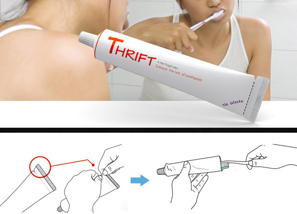
4. ไอเดียออกแบบบรรจุภัณฑ์
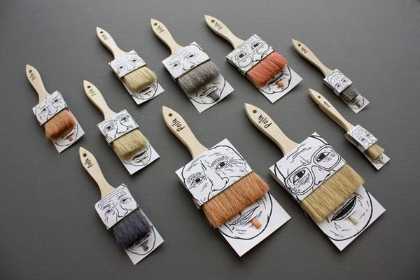
5. ไอเดียออกแบบบรรจุภัณฑ์
6. ไอเดียออกแบบบรรจุภัณฑ์
7. ไอเดียออกแบบบรรจุภัณฑ์
Posted in: Knowledge
Leave a Comment (0) →Archive for January, 2014


Posted in: Knowledge
Leave a Comment (0) →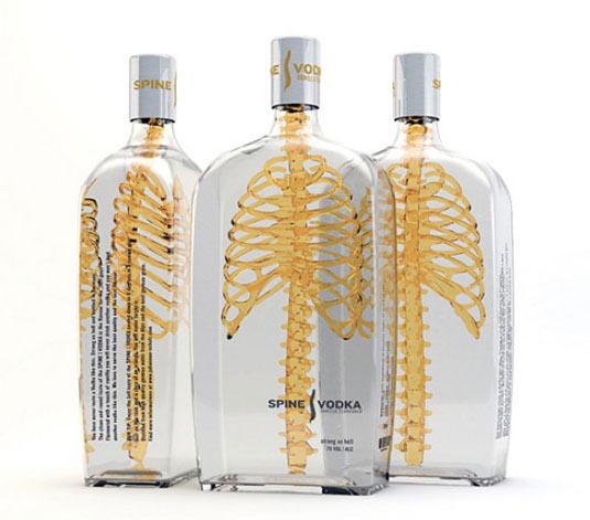
German designer Johannes Schulz created this inspirational packaging for Spine Vodka. “It was a private project I started after my graduation of an international communication design school in Hamburg, Germany,” he explains. “Spine is a high quality product just like the design, reduced and simple with a consciously ‘twist’ in his message and a memorable name fitting to the project.”
Integrated the spine with the rib cage to communicate a product with a ‘backbone’, the unique 3D design approach sets it aside from its 2D counterparts. “The transparent glass material stands for a product that don’t has to hide something,” Schulz concludes.
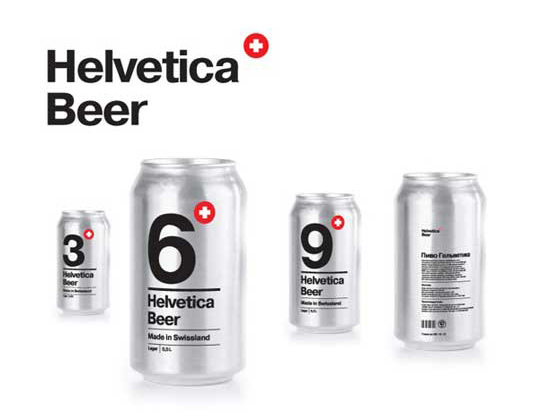
Students are renowned for like a beer or two. So we weren’t surprised to learn that this cool new packaging design was a school project, designed by Sasha Kischenko at the British Higher School of Art and Design.
Tasked with creating a package design using type only, Kischenko opted to develop a concept for beer from Switzerland’s historical Helvetic republic – so the typeface was an obvious choice.
The sophisticated design centres around a large digit informing you of the alcohol percentage, with a small Swiss Cross logo in the top right. Can colours, silver and black, correspond to lager or stout respectively. A simple but beautiful concept, we could see this product in the hands of many a student if it were ever to become a reality!
Posted in: Knowledge
Leave a Comment (0) →Next time you go to a supermarket, pick a random shelf and browse through some products. Glance at each and ask yourself two very simple questions:
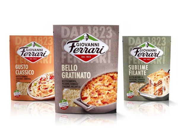
A great example of simple, clear yet highly distinctive packaging design.
You’ll be amazed how hard it is to find answers to some of these essential questions in less than four seconds, the maximum time an average consumer will dedicate to any particular product. Now imagine your brand sitting alongside your competitors’ logos. To cut though the clutter, a busy logo isn’t going to do your business any favors. Think about what makes you different — your special sauce — and lead with that. Remember, some of the world’s most successful logos are also the simplest. Here are some packaging design tips for food and consumer products.
Have you ever bought a package of cookies and been disappointed that the mouth-watering goodie shown on the package turned out to be a tiny, dry wafer? By depicting a product ten times better than it actually is, you’re misleading and ultimately disappointing the consumer. Poor sales performance and bad brand image often follow.

This product might taste good, but the packaging is clearly misleading. More packaging v.s. real food comparisons on this site.
This is where honesty comes in. Consumers have nothing against simple, inexpensive products, as long as they know what they’re buying. As a business, you want to sell your service or product by representing the product in the best light possible, but keep in mind that stretching the truth can backfire. Be straightforward with your customers to keep them coming back.
Originality and memorability are at the heart of great brands. Looking at packaging designs, it’s easy to understand why. With hundreds of products out there, all competing for consumers’ attention, the only way to set your brand apart is to be different and authentic.
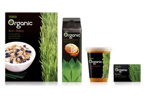
This packaging design from Colin Porter Bell is a great example of authentic and memorable packaging design.
If you’re stuck with a generic-looking design, whether it be your logo or a banner ad, it may be time to think outside the box. Inspire your graphic designer by collecting images that remind you of your special sauce – colors, photos or designs from other industries. Hey, you might even want to look at product packaging examples while brainstorming your next book cover.
From a shopper’s point of view, a product is never seen alone and never in great detail. In the rows and columns we see veritable patterns of products, and it’s not until a certain pattern attracts our attention that we decide to take a closer look. This distinctiveness and appeal of the product when placed on an actual shelf is something retailers call “shelf impact,” and it makes a huge difference in product sales.
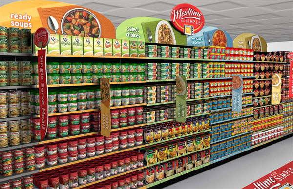
This is what you actually see in a supermarket. Which product caught your attention first?
You should incorporate the concept of shelf impact into your brand messaging. Take a look at your website home page, for example, where you’ll only have a few seconds to convince visitors to stay. Is your design eye-catching? Does the headline entice people to read more? With so many other options available, people need to ‘get’ your message almost immediately.
A product packaging design concept should allow for an easy introduction of a new line extension or a sub-brand. For example, a new brand of apple juice may eventually introduce a cherry flavor under the same brand name, so creating a flexible design is critical from the start.
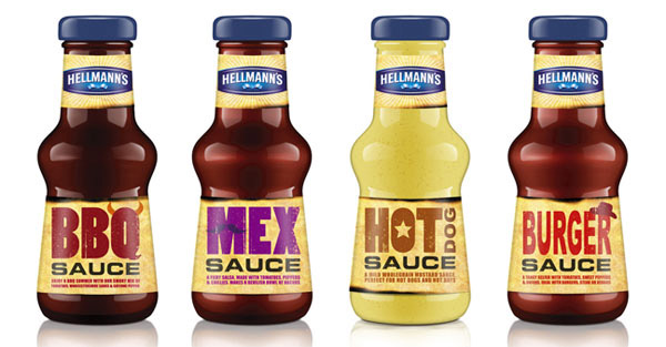
Good packaging design allows for easy variations without losing visual appeal.
Always design your materials with the future in mind. When creating a new logo, for instance, tell your designer right off the bat if you plan to add sub-brands. On the web, create a navigation system that allows you to easily add content. And be sure to share any existing brand materials with your designer so that each new piece will contribute to a cohesive look and feel.
Practicality deals with the actual functionality of a product, not just the label or wrap. The more practical the product, the more sales it gets – when Heinz turned the ketchup bottle upside down, sales skyrocketed.
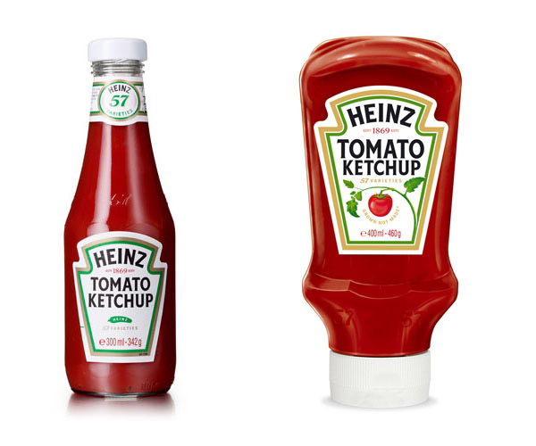
Turning things on their head helped Heinz sell more ketchup when ketchup industry was in growth crisis.
For you, practicality is found in user experience. When planning your website, think about how you’re solving a visitor’s problem and you’ll prevent many usability issues from arising. Easy ways to make your website more practical include eliminating clutter, simplifying navigation, providing a clear call to action and placing your contact information front and center.
Credit: 99designs.com
Designated trademarks and brands belong to their respective owners.
Posted in: Knowledge
Leave a Comment (0) →