Posted by KVJ on March 4, 2014 แนวโน้มการออกแบบบรรจุภัณฑ์ 2014 – The Packaging Design Trend 2014
No matter how much people rely on social media and emails to communicate, the one thing that they’ll never stop needing is packaging. Packaging is just as important as the product itself, and it goes a long way toward convincing customers that they want what’s inside.

Most people don’t think about the packaging on the products they purchase or the boxes that those products are mailed in. But it has a tremendous impact, and just like any industry, the packaging industry is subject to trends and developments. Here are some of the exciting new developments to watch for in 2014.
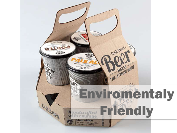
1. แนวโน้มบรรจุภัณฑ์ 2014: เป็นมิตรกับสิ่งแวดล้อม
The green movement is continuing to gather strength, and environmentally friendly packages are a great way to make inroads with concerned customers. As a result, many businesses are looking toward investing in packages that are environmentally friendly either because they are biodegradable or made from recycled products. It makes for a great selling point and reduces consumer guilt about buying products in packages.

2. แนวโน้มบรรจุภัณฑ์ 2014: หลายการใช้งาน
Sometimes people buy products just as much for the bonuses as they do for the actual product. Packages that serve multiple uses are going to be even more popular in 2014. Even if the packaging itself isn’t environmentally friendly, a product that has a package with multiple uses will still be seen as superior to one that only contains the product. The packaging design needs to make the multiple uses clear, though, or else this trend won’t succeed.
3. แนวโน้มบรรจุภัณฑ์ 2014: การใช้ Mascot
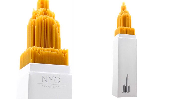
When it comes to cartoon characters, creative packaging can turn a boring product package into an exciting must-have option. McDonald’s realized this long ago with their Happy Meals designed to look like little houses, complete with cutout doors for the Cabbage Patch dolls. But for quite some time, those creative packaging options relied primarily on simple box shaped designs.
With breakthroughs in the printing industry including 3D printing, such limitations won’t be as big of an issue in 2014. This means that businesses that want to explore more creative options for mascot incorporation will be able to do it.
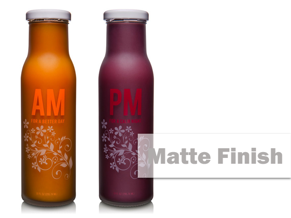
4. แนวโน้มบรรจุภัณฑ์ 2014: ผิวด้าน
From Glamour magazine to the pamphlet “Projected Business Trends in Indiana for 2014,” the matte finish looks to be one of the more common design elements in packaging. It isn’t as sleek or as stylish as a polished finish, but it isn’t tacky either. Visually, it stands out. Bright colors can be used, but they aren’t as overpowering because the matte subdues them.

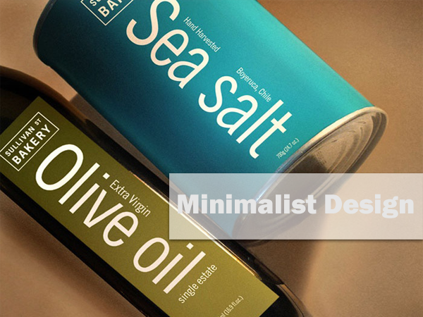
5. แนวโน้มบรรจุภัณฑ์ 2014: การออกแบบเรียบง่าย
The minimalist design movement has made some of the biggest waves in the web design community, particularly on mobile websites and iOS platforms. Simple black-and-white photography and flatted UIs have created a whole new palette. For businesses with products to sell from their websites, matching the packaging design with the web design can be a great step. An added benefit is that the minimalist design tends to be less expensive to print, which also makes it popular.
Packaging isn’t going to go away any time soon, but it is going to keep developing. 2014 looks to be an exciting time with new trends. Packages that are environmentally friendly while also having multiple uses will likely develop. The functional form that benefits the seller as much as the consumer will also probably make its showing and increase in popularity, particularly as it resolves common problems for shop owners. Of course, packaging trends for 2014 will also extend to safety measures along with product variation changes to indicate expiration or tampering. And design changes will likely move toward the matte finish as well as the minimalist design. Look for packaging to be more exciting than ever.

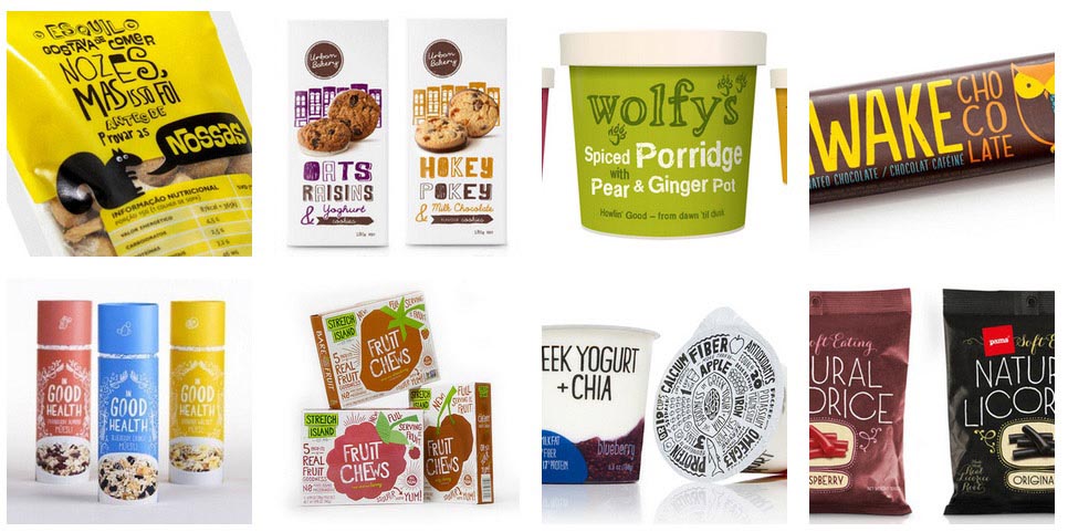
6. แนวโน้มบรรจุภัณฑ์ 2014: เขียนลวดลายแบบอักษรมือเปล่า (Freehand Fonts)
This trend characterizes itself for its handwritten and carefully “untidy” fonts, which address to the consumer in a friendly and authentic tone. Casual, informal and cool designs that look fresh and spontaneous. Decorative fonts and touching illustrations humanize the product and makes it look handmade. A graphic resource that was used only by few products focalized on a reduced group of consumers; today is gaining adepts and acceptation between consumers.
In an attempt to move away from massive and industrial products, these packaging designs align themselves with a tendency that appreciates origin along with handcraft products, opposite to the artificial imagery associated with industrial manufacture process. Today, human is not only about warmth, it is also a sign of authenticity.

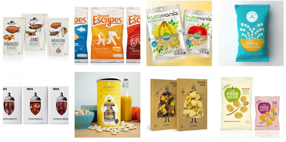
7. แนวโน้มบรรจุภัณฑ์ 2014: แสดงความเด่นของผลิตภัณฑ์ด้วยผลิตภัณฑ์
This trend sets an integration between product and graphic elements in order to seek a playful approach to the product. Flat graphic elements combine with 3D pictures to achieve an abstraction from reality that is both attractive and differentiating.
As a result, the product gains significance to strengthen its values, inviting the consumer to a different experience. Reality and fiction combine themselves resulting in a magical graphic solution. These are just some of the many aesthetic trends we can find nowadays in packaging design worldwide. Each of them has singularities but they all converge in the seeking for differentiation and segmentation in a world of consumers demanding constant innovation.

Credit: thedeependdesign.com / thedieline.com (แนวโน้มบรรจุภัณฑ์ 2014)
