Packaging Ideas and Designs ไอเดียและการออกแบบบรรจุภัณฑ์
1. Packaging design: Spine Vodka

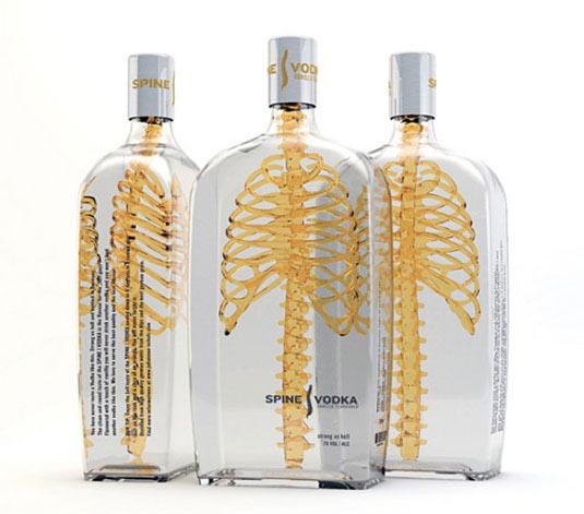
Packaging Design: This vodka brand gets down to the bare bones of packaging
German designer Johannes Schulz created this inspirational packaging for Spine Vodka. “It was a private project I started after my graduation of an international communication design school in Hamburg, Germany,” he explains. “Spine is a high quality product just like the design, reduced and simple with a consciously ‘twist’ in his message and a memorable name fitting to the project.”
Integrated the spine with the rib cage to communicate a product with a ‘backbone’, the unique 3D design approach sets it aside from its 2D counterparts. “The transparent glass material stands for a product that don’t has to hide something,” Schulz concludes.
2. Packaging design: Helvetica Beer

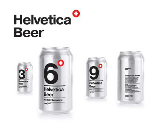
Packaging Design: A school project turns a typeface into a beer
Students are renowned for like a beer or two. So we weren’t surprised to learn that this cool new packaging design was a school project, designed by Sasha Kischenko at the British Higher School of Art and Design.
Tasked with creating a package design using type only, Kischenko opted to develop a concept for beer from Switzerland’s historical Helvetic republic – so the typeface was an obvious choice.
The sophisticated design centres around a large digit informing you of the alcohol percentage, with a small Swiss Cross logo in the top right. Can colours, silver and black, correspond to lager or stout respectively. A simple but beautiful concept, we could see this product in the hands of many a student if it were ever to become a reality!
Posted in: Knowledge
Leave a Comment (0) ↓